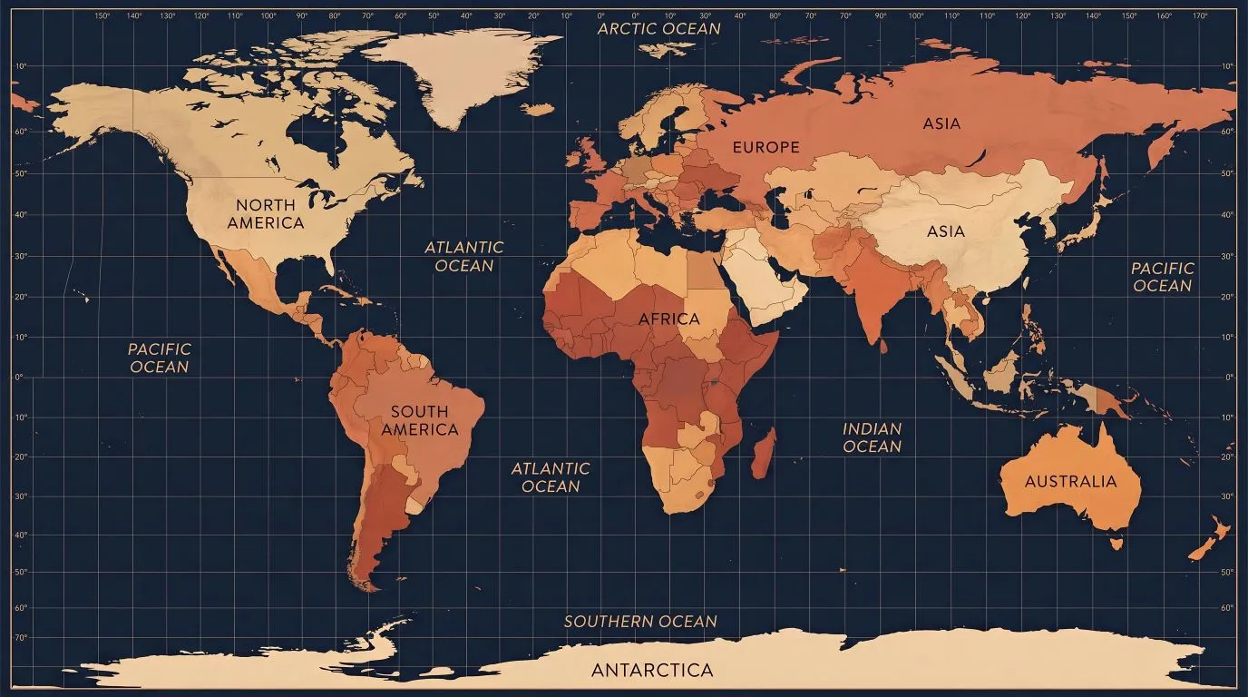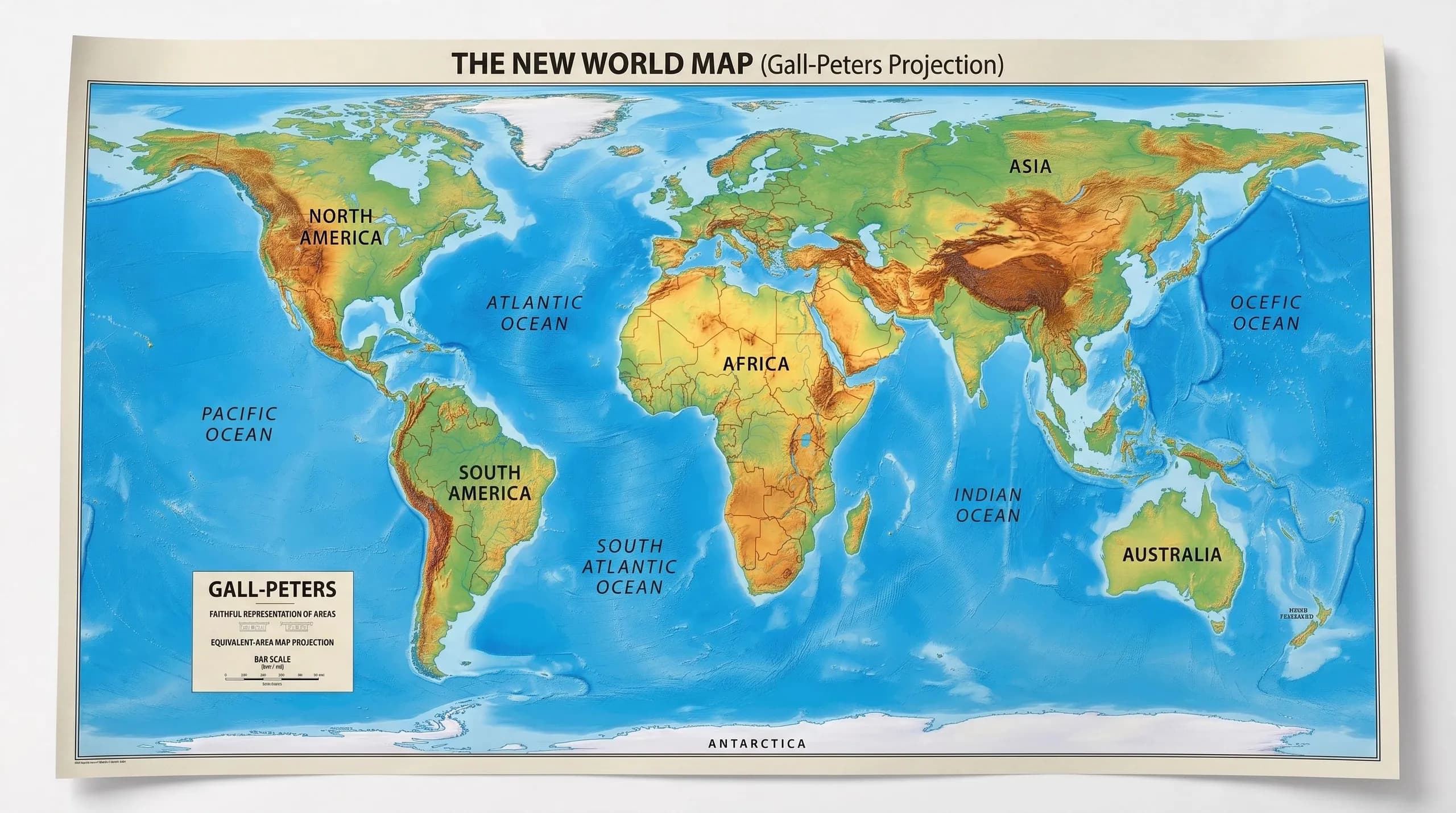
For 450 years, every map in every classroom, every newsroom, every government building, every Google search result showed Africa as roughly the same size as Greenland.
Greenland. A country of 56,000 people. An island covered mostly in ice.
Africa. A continent of 1.4 billion people. 54 countries. The second-largest landmass on Earth. A place 14 times larger than Greenland.
The same size. On every map you've ever seen. For four and a half centuries.
On Friday September 4, 2026, the United Nations General Assembly voted 164 to 1 to correct that.
And I want to celebrate that. I genuinely do. But I also want to ask the question the celebration wants us to skip past: how did we let this go on for 450 years? And does changing a map actually change anything?
What actually happened and why it matters.
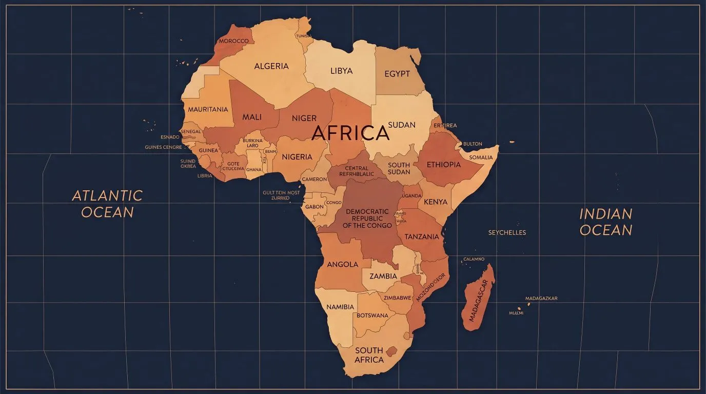
The "Correct the Map" resolution, sponsored by Togo and backed by the entire African Union, was passed by an overwhelming majority. 164 countries said yes. Six abstained Estonia, Georgia, Lithuania, Moldova, Serbia, Ukraine. And exactly one country voted against it.
The United States of America.
The US State Department called the resolution "a radical ideological project."
Let that sit with you for a moment. Asking the world to show Africa at its actual size is, according to the United States government, a radical ideology.
Not adjusting centuries of documented distortion. Not correcting a navigational tool that was repurposed as an educational standard. Not showing the continent where humanity itself originated at its real, documented, measurable size.
Radical. Ideology.
The resolution endorses replacing the Mercator projection a map created in 1569 by Flemish cartographer Gerardus Mercator for European sailors navigating at sea with the Equal Earth projection, a 2018 map that shows continents in their true proportions. The Mercator distorts landmasses by expanding regions near the poles making Europe, Russia, North America, and Greenland appear enormous while shrinking everything near the equator. Which means Africa, Latin America, and South Asia all look smaller than they actually are.
The result is a world map that has spent nearly five centuries telling every child on earth subliminally, repeatedly, in every classroom that some parts of the world are bigger and more important than others. And it was never an accident.